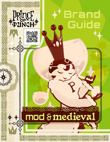
prince of punch
brand identity and style guide
January 2026
Prince of Punch is my own design studio and small business. It's a brand built around original artistic vision and the philosophy that beauty belongs in everyday life. This brand identity suite and style guide is the full visual foundation I created for it from the ground up.
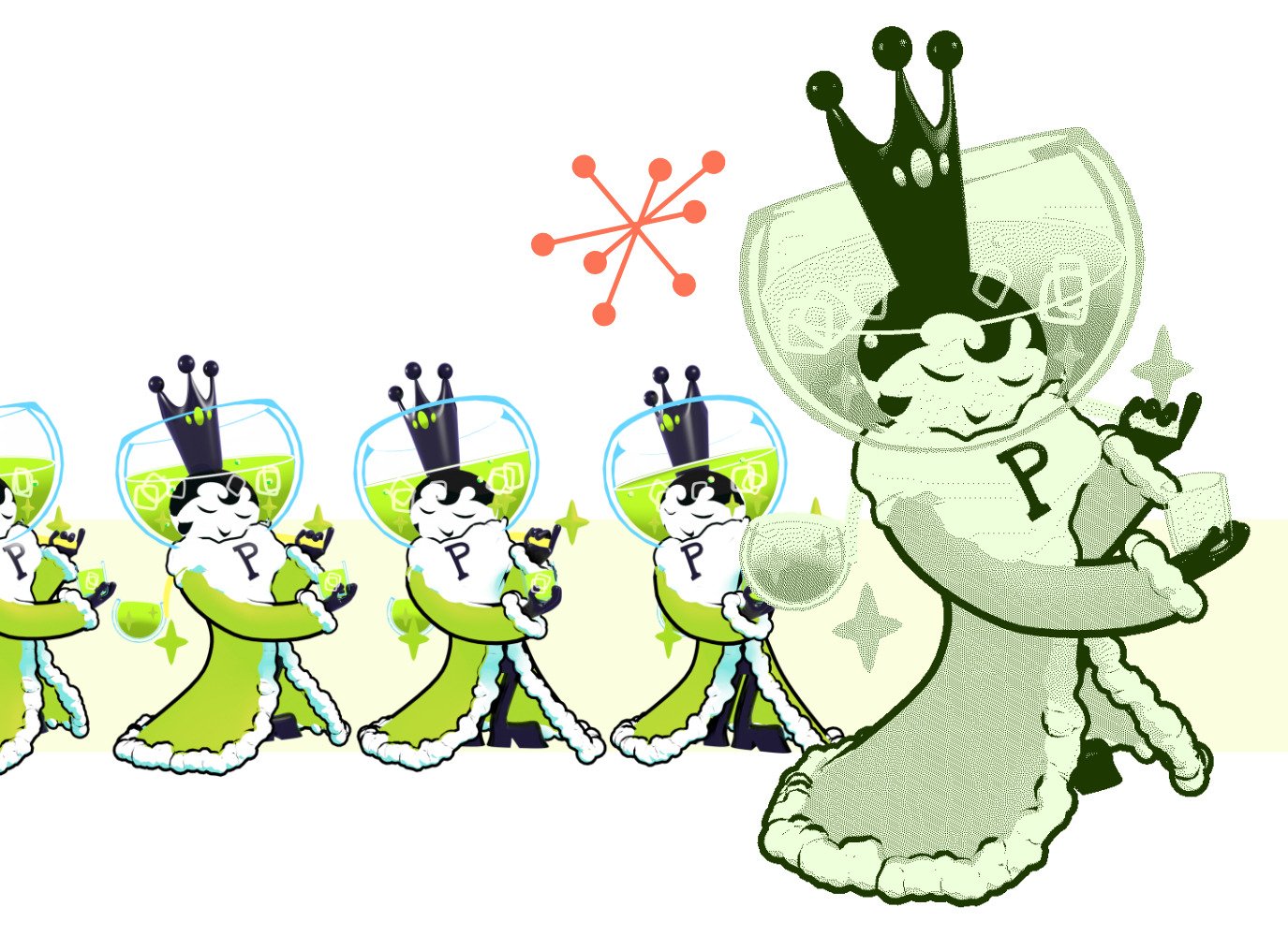
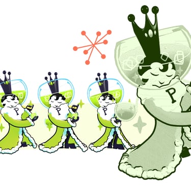
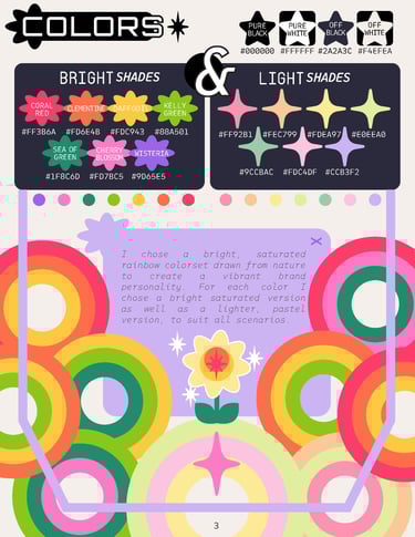
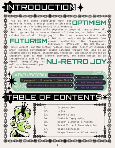
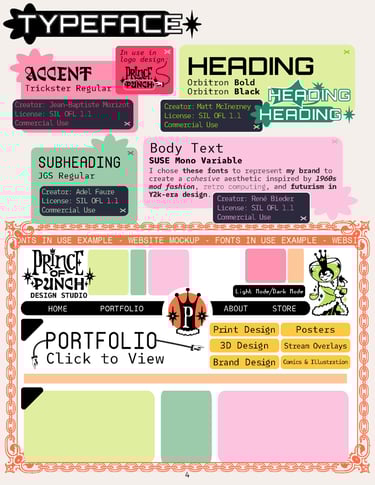
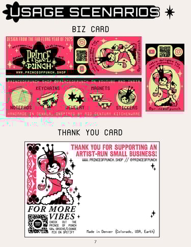
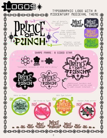
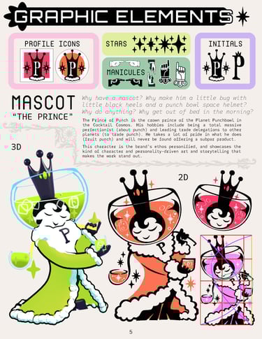
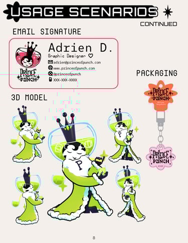
The brand fuses three distinct retro-futurist aesthetics; Supergraphic Ultramodern (1960s–70s), Neo-Y2K Revival, and Mid-Century Medieval into something coherent, distinctive, and immediately recognizable. The guide covers logo systems (including a typographic wordmark and an 8-sided star frame logo in multiple colorways), a full dual-tone color palette with both bright and pastel variants, four curated typefaces with usage rules, a custom illustrated mascot (rendered in both 2D and 3D), a graphic asset library, brand voice guidelines, and applied usage mockups across printed materials.
I created this because if I was going to seriously approach creating my business, I needed to apply that level of care and direction to its branding; create something which is not only attractive but also serves as scalable, consistent infrastructure. This project demonstrates a complex, multi-asset visual identity system with a clear point of view, one that works across print, product, and digital touchpoints without losing its character. Building this guide forced me to adopt the perspectives of designer and brand strategist: every decision has to be intentional, documented, and reproducible by someone other than me.